Among additional interesting note is that “Jonah” is not as easily read on the first replica, but the first replica has fish in the margins where the second replica has an easy-to-read “Jonah” but no fish in the margins.
It seems as if the props Jacobovici uses change to suit the mood. 🙂
To read more about this messy issue, be sure to check out my previous post here.
UPDATE Sep 18:
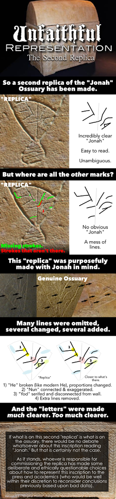
 |
| Second replica in red, James Tabor’s “yellow inked” outline in yellow. |
As pointed out by several others, an examination of the “yellow-lined” version of “Jonah” offered up by James Tabor is not identical to the form found on the second replica, however it does share some interesting features.
- The serifed, disconnected “yod.”
- The oddly double-curved “waw.”
- The connected & exaggerated “Nun.”
- The “broken” “he.”
Curious, the similarities, including lines that aren’t there.
Peace,
-Steve
Steve, thanks for your post. I would point out what I know. The two replicas were never intended to be used for epigraphic purposes, or any kind of detailed study of features, but to show the general placement and representation of features on the ossuary–which you really can’t tell from all the close up probe camera photos from all angles. One was made by Discovery Times Square, they own it and it was an adjunct exhibit to their Dead Sea Scrolls exhibit, which includes the Talpiot tomb ossuaries, now on tour–I think it is in Boston with Chicago next. The other was done in Israel by Associated Producers. Both were done before Charlesworth recognized the inscription in the “head” of the fish. There is no question the second is more accurate in various features (the fish is more correct proportionally, etc.) and the main difference was the right panel was left blank since the tiny bit that could be seen in the photos, blocked by the other ossuary, looked odd–people thought it was some kind of hangman’s gallows and were trying to interpret esoteric meaning from it. What you need to do is look at the HiRes photos. Far from a “mess of lines” it is clearly YONAH, and your “mess of lines” drawing indeed reads clearly Jonah as well. Take a look at other graffio ossuary inscriptions, the style and “messiness” is identical. I will be blogging on this soon and have pulled in all the parallels. In the meantime the best two clearest photos are at http://jamestabor.com/2013/09/13/can-you-read-jonah-in-hebrew/
Dr Tabor,
Thanks for your response. Where I do understand that no replica is perfect, you must admit that there has been enough messing about with the data to give anyone who is trying to be dutifully critical pause.
The first replica did not have “Jonah” very visible at all, and yet there were ichthoi in the margins, a feature that did not appear on the ossuary, but was advanced in the initial press release. Why was this done? Whose data or the sketches did they use to add these non-existant fish?
The second replica “fixes” these erroneous fish, but then greatly cleans up “Jonah” to the point that it is unambiguous.
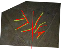
The biggest problem really is not the lines that have been *removed* (despite the fact that doing so makes things “click” much more clearly) but the lines that have been *added* or *altered.*
There is no triangle serif on the “yod.” It is simply not there, and nothing that large!
However, on the yellow-line image, it is filled in and on the replica is is not only there, but greatly exaggerated, and the connecting line above it is removed. These two choices resolve any ambiguity into a yod.
The waw oddly curves one way and then curves back on the replica, which is similar to how it appears on the yellow inked image. However, all of the other pictures show that there is no recurve and it forms a *very* distinct “lens” shape with the top stroke of the “yod.” This is unambiguous.
The crook of the “nun” is much longer before crossing the center line than it is even in the clearest pictures and only one picture hints that it is connected (indeed some pictures show that it is not connected at all).
The “he’s” proportions have been changed, and its left leg has been “broken” like a modern He, where every single picture shows that it is indeed connected. Again, this is a similar break to what’s in the yellow-inked understanding of the inscription.
Did it just happen that whoever was responsible for this replica made these artistic decisions by mistake? Unknowingly and very effectively isolate this unambiguous image from other marks? Were these very specific string of unexpected coincidences that make something visible that is not as obvious as it is on the original?
Given, as you say, that it was created by AP (which was responsible for that horridly manipulated CGI composite image in the beginning and much misinformation and sensationalism, and that this sensationalism is how they make their living) I cannot trust that *any* of this was done by chance.
As such, this replica is an unfaithful representation of what is on the actual ossuary.
But it doesn’t stop there.
The video with Professor Puech makes it clear that, where he did *glance* at the “high resolution picture” for a moment when Simcha opened it up (and the placed on the far side of the table) he was for 99% of the “interview” reading *from* the replica. When he’s talking to Simcha, he’s pointing to it and discussing each element he sees and this is shown from both the closeup shots and long shots. Anyone reading something that clear can do so with confidence. (Even when it’s incorrect.)
And he’s right. The replica reads “Yonah.”
The genuine ossuary? No. Not at all.
I can liken all of this to the “Cannes Film” nonsense. I am firmly convinced that you did not mean to put “Festival” at the end of your blog post title. It was an honest mistake that I believe you were unjustly criticized for.
It’s simply that the association with “Cannes Film” and “Festival” is *so* strong, that it’s the association that *everyone* makes first before they realize otherwise (and what the people who run the “gala” bank upon). I am also convinced that this is what Simcha banked upon as well. He’s a very smart man when it comes to publicity. It’s his job. 🙂
However, this is how things get messy.
Peace,
-Steve
Thanks for your response Steve. I am preparing a blog post on this but it won’t be done until next week as I am traveling this weekend. I do recall that Charlesworth’s original article on the inscription contained some really good analysis on the styles of these letters, parallels to other ossuary inscriptions, etc. Also, both Hachlili and Puech studied the photographs first…the taped segment was just an on-camera presentation or summary. Puech was not analyzing the replica off the cuff, he had already done his analysis and now was presenting it. BTW, in terms of the 1st and 2nd replicas, I was just looking at the photos first released in March, 2012 up on the web site thejesusdiscovery.org, including the CGI image, and it seems to me that the letters are fairly clear, the nun not broken, etc. The photos on my recent blog are better in that they are close ups and taken from the HiRes camera–gives an “orange” color, so you can tell them apart from the probe camera. I do know that neither Felix or the AP team who did the 2nd replica had any notion of the word “YONAH” appearing in the head as Charlesworth had not yet made his analysis. They were working on that replica in March to get it ready for the film release in early April. I think they tried to be more careful with details, and so overall I prefer it to the 1st, but I don’t want to put down the good efforts of those who did the first one. It is a challenging task to take all those photos and represent them. The idea, as I have pointed out several times, was to show the arrangement of the features and represent the features in a basic way–but surely not to study details, which should only come from the photos–as that is all we have.
Does “more attention to details” imply the complete removal of several lines that are quite apparent in the HD photos of the fish head? Because the 2nd ossuary “replica” has ‘disappeared’ those lines and made a few connections that are missing in the original photos you’ve given. Of course it is impossible to know wth any certainty because you’ve not released any clear, large HD photos of that region. I’d happily give way on this point if you could send a few high quality, large, HD photos that are not grainy to Steve and I to evaluate.
Dr. Tabor,
“Thanks for your response Steve. I am preparing a blog post on this but it won’t be done until next week as I am traveling this weekend. I do recall that Charlesworth’s original article on the inscription contained some really good analysis on the styles of these letters, parallels to other ossuary inscriptions, etc.
I would love to go over that analysis piece by piece critically, however in the comments section might not be the best place to do so. If memory serves, his interpretation also seems to rely upon some of the same features that ended up on the second replica that simply are not on the ossuary, which I find curious.
Puech was not analyzing the replica off the cuff, he had already done his analysis and now was presenting it.
Like most things that Simcha does, nothing is truly off-the-cuff and most sins attempt to be covered up in post production. 🙂 What do you think about some of Puech’s subsequent statements about the “interview” and his analysis?
BTW, in terms of the 1st and 2nd replicas, I was just looking at the photos first released in March, 2012 up on the web site thejesusdiscovery.org, including the CGI image, and it seems to me that the letters are fairly clear, the nun not broken, etc.
Then we are not looking at the same images, Dr. Tabor. The CGI image, especially, does not read “Jonah” in any way, and has been outlined several times by several different bloggers to demonstrate this fact.
I am sorry, but on that point you are *categorically* incorrect.
The photos on my recent blog are better in that they are close ups and taken from the HiRes camera–gives an “orange” color, so you can tell them apart from the probe camera.
I also find the “HiRes” camera designation dubious as there is nothing high resolution about that photograph in the least.
The largest example that has been published is 500×281 pixels. That is a *tenth* of a megapixel. A “high resolution” camera should be at *least* a megapixel (1152×854), where most “high resolution” cameras nowadays off-the-shelf are more than 5 megapixels (2560×1920 pixels or larger).
Can we please refrain from referring to this image as “hires.” It is incorrect and misleading by all conventional definitions.
Unless there is a high resolution version of this shrunken photograph? If there is, would you be willing to publish it for us? That would put a lot of problems to rest.
[cont’d]
… Charlesworth had not yet made his analysis. They were working on that replica in March to get it ready for the film release in early April. I think they tried to be more careful with details, and so overall I prefer it to the 1st, but I don’t want to put down the good efforts of those who did the first one.
By all accounts, the second replica is much less accurate than the first, fish in the margins aside. Mark Goodacre has actually put together a very good comparison of features (such as obvious discrepancies as well as shading) that demonstrates this very well:
http://ntweblog.blogspot.com/2013/09/how-accurate-is-that-replica-and-why.html
Many pertinent details were omitted, and “Yonah” on that replica is far too clear to have happened by chance. I’ve even pointed this out side-by-side on the blog post after this one here:
http://aramaicdesigns.blogspot.com/2013/09/a-comparison-of-first-replica.html
Out of all of the features, why include a serif that isn’t there in *any* of the photographs, let alone exaggerate it?
Given it was purportedly made by AP, I do not think that these features chosen were “off the cuff” (as before). 🙂
It is a challenging task to take all those photos and represent them. The idea, as I have pointed out several times, was to show the arrangement of the features and represent the features in a basic way–but surely not to study details, which should only come from the photos–as that is all we have.
Then I look forward to when the ossuary is properly excavated.
If this is “all we have” to go by, then I would like to see the photographs better represented.
Peace,
-Steve