Tag Archives: james tabor

A Little Bit More Perspective – A Demonstration

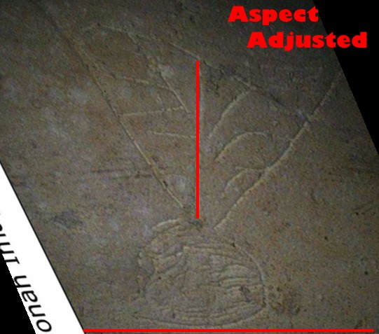
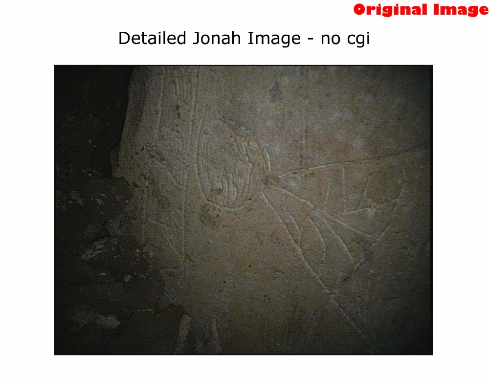
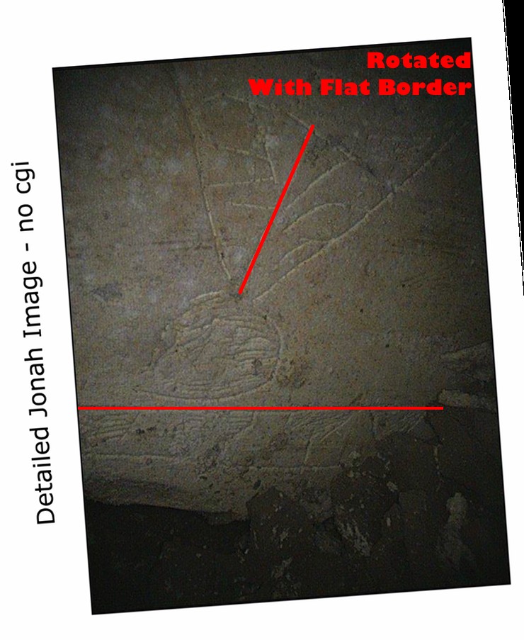
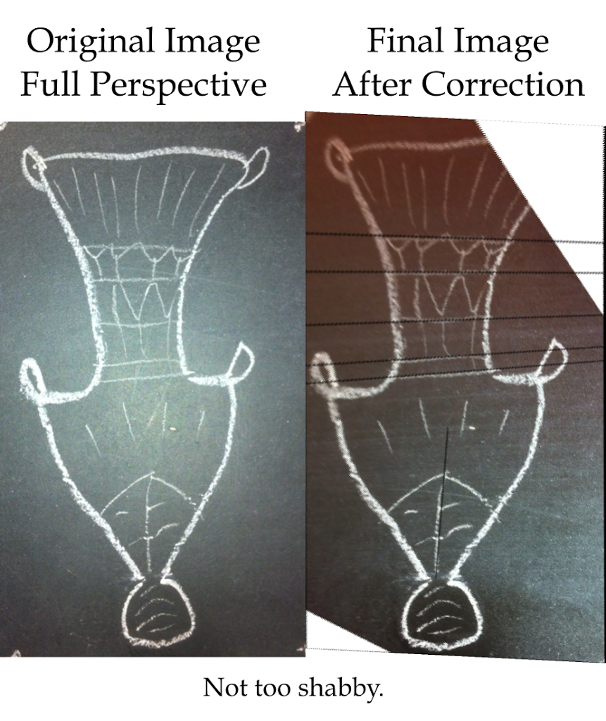
The original image on the left, the image that was corrected from a skewed angle shot on the right.

 
 So image manipulation can be fun when you do not have a reference to compare something to. This is why in my last post, Dr. Tabor made a very good comment:

What I asked Bob I will ask you. If you took a clear straight on picture of your face, tiled it at 45degrees, took a shot of it, at that angle and from the side a bit, then used these techniques to “correct” perspective do you think you would end up with a photo that pretty much looked like you, proportional and pixel wise. In other words, does the stretching process shift things around. Maybe you can give it a try. It would be interesting.

I had actually been working on something just like that on and off for the past week or so to make sure that the technique I was employing worked properly without adding anything untoward to the final image.

Let’s take the following chalk doodle:

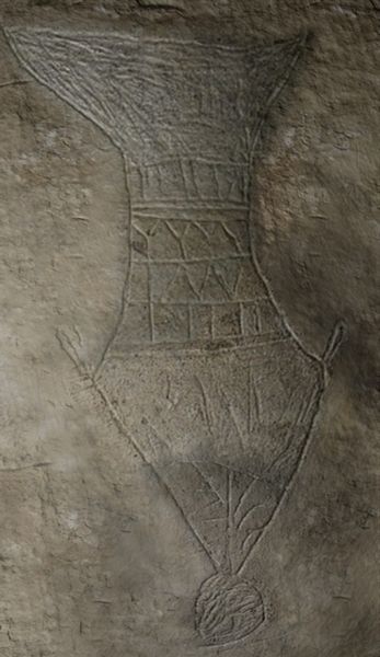
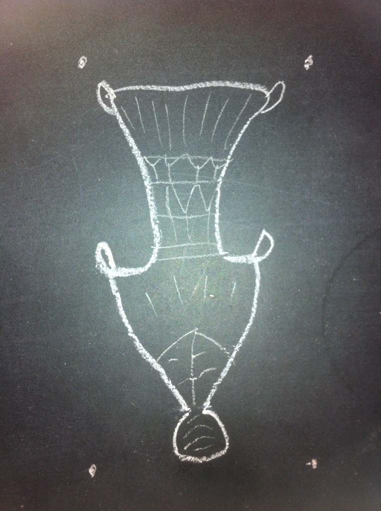
Head-on full perspective shot of our inscription.

I know I am not a master artist, but I tried from memory to reproduce a number of features on the “Jonah Ossuary’s” image roughly. It’s not completely well-formed and not completely symmetrical, but it isn’t too bad either (or so I like to think). 🙂

Also note the four dots. These are (quite literally) points of reference. If I were to skew this image in any direction, and still have these four points of reference and a rough idea of the ratio of the image’s width and height, it’s a simple matrix transformation to bring this image back to its original size.

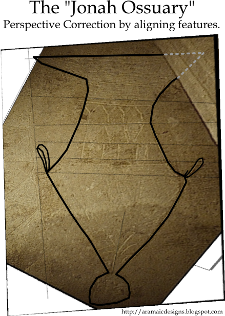
This is why if we had a single shot of the Ossuary image that showed its top, side, and bottom borders, there would be no problem adjusting for perspective.

However, the images we have are missing some of these points of reference, simply because of how cramped the ossuaries in the tomb were packed. At best we can get one or two of them at a time.

In my reconstruction, I was able to estimate where the missing points of reference were by following the contours of known lines on the inscription and plotting where they intersected.

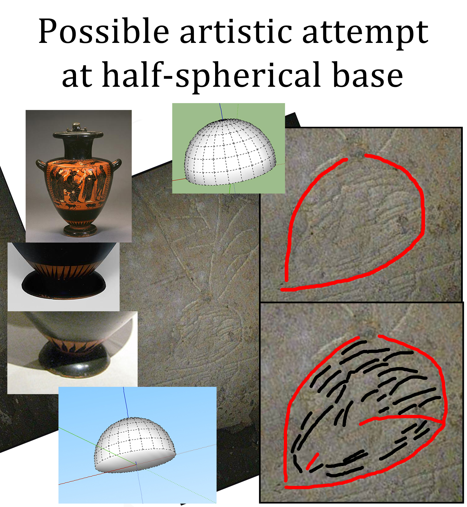
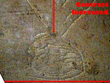
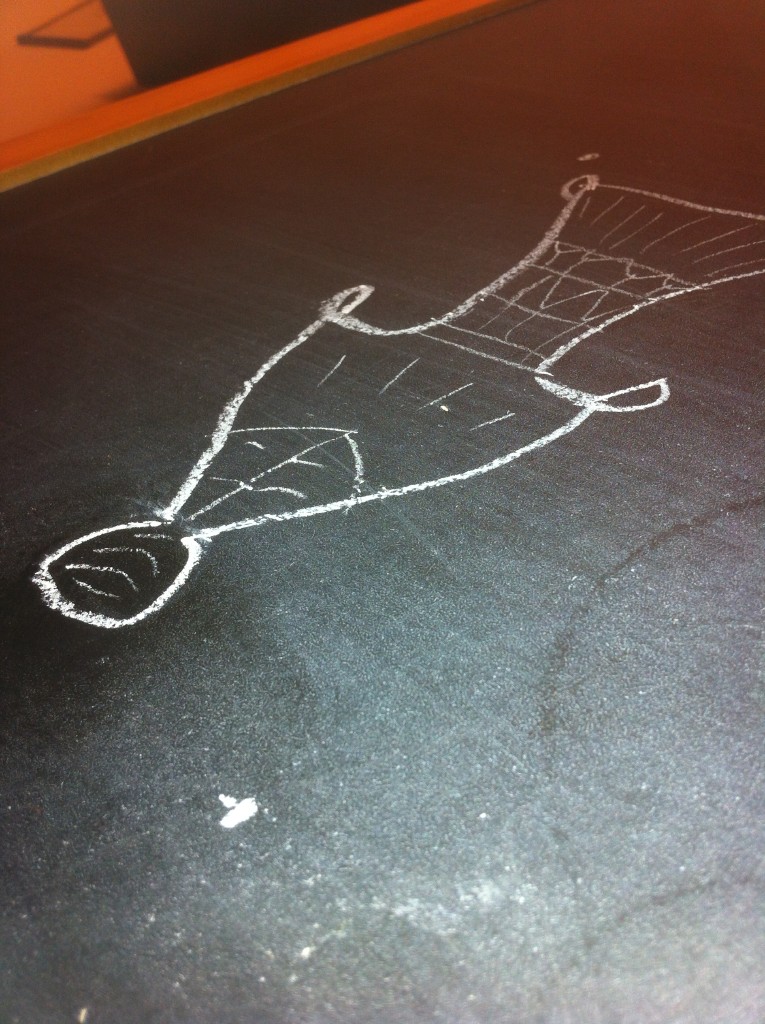
Note how the flat base look rounder now.

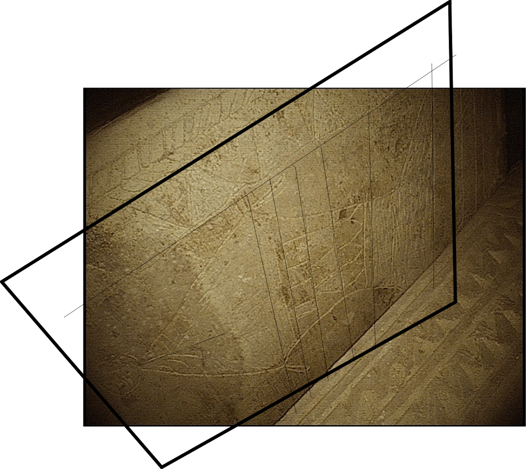
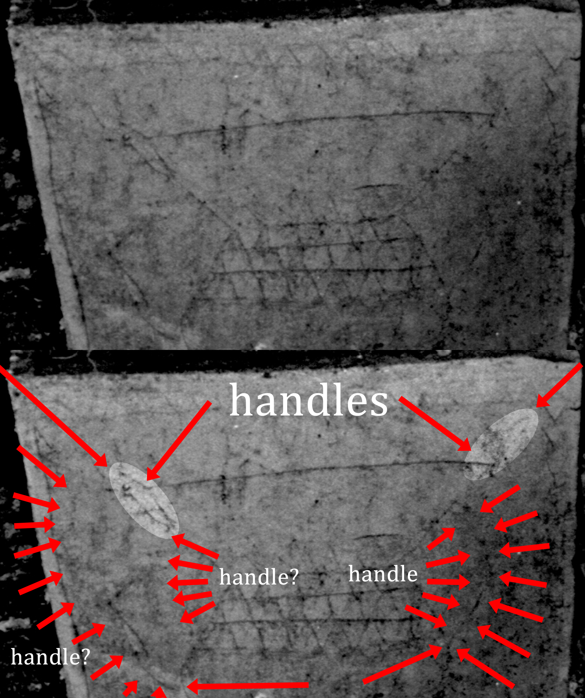
So, with using my masterpiece drawing, I took a shot on a high angle where I was missing points of reference.

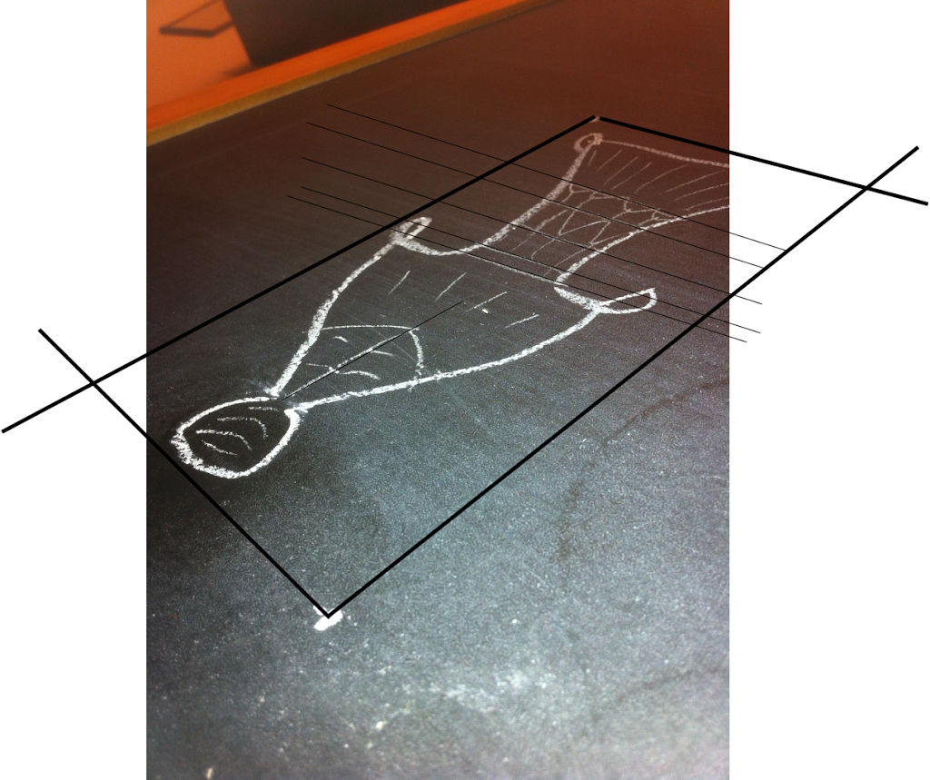
From there I traced the contours of the image from what points of reference I had to estimate where the other points of reference might lie, “gridding” things out. As you can see, most of these lines are (excusing the pun) straightforward. 🙂

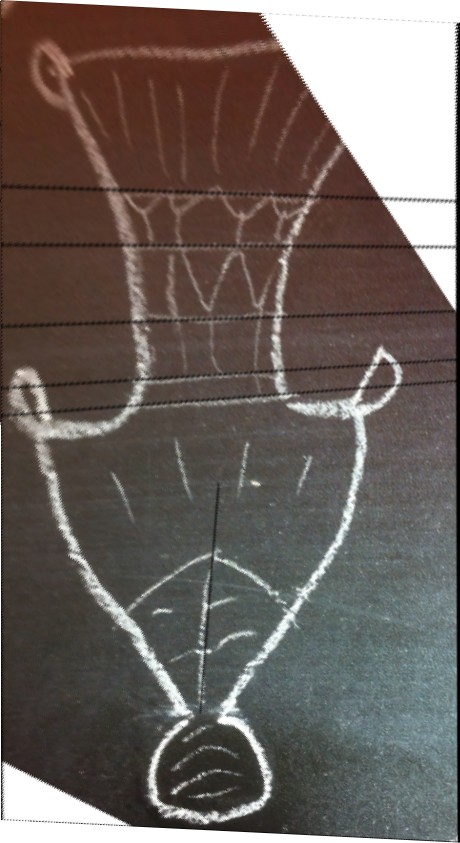
From there I applied the matrix transform, plus a few degrees of skew to compensate for camera lens distortion (as I did with my prior reconstruction) and this is what I got.

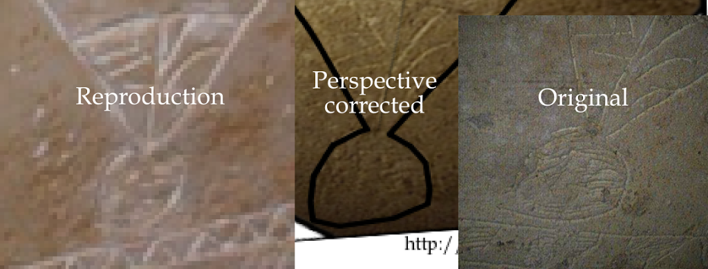
Comparing it to the original image, we can see that my method is not perfect, but it’s an extremely good approximation with negligible distortions.

In doing this I have realized ways that I can refine my original reconstruction:

1) Lens distortion can sometimes leave straight lines curved. This is especially the case with a fish-eye or wide-angle lens; however these can be corrected by using a simple filter in GIMP that can re-map one view angle to another.

2) Tracing contours can be made easier by checking other photos for reference. The bottom-most feature is nearly up against the bottom border in one shot, where in the large sepia shot I used the border was not easily visible. Lining those two photos up will allow a better approximation of the bottom-right corner of the reference frame.

3) The final image width-to-height ratio is very important. I based mine off of the relative proportions on the reproduction ossuary, but again checking the other photos more closely will allow a better approximation (which won’t be much different, but every grain of accuracy counts). 🙂

All in all, I think it works well.

Peace,
-Steve

A Little Bit More Perspective – The Patio Tomb Jonah Ossuary

Robert Cargill has made a video that demonstrates, step by step, how to correct the perspective distortion of the high-angle camera shots of the so called “Fish” on the “Jonah Ossuary”:

It’s nearly a half hour long, but it’s rather thorough.

I’ve been working on a similar perspective correction illustration by aligning the features of the drawing relative to its “canvas” (i.e. the size and shape of the ossuary itself).

I first started out with image #14 from the “The Jesus Discovery” website as it is so far the most complete of the pictures released.

It may be labeled “no CGI” but that’s a little bit of a fib. As we’ve seen from other images of the ossuary, this nice, uniform sepia tone is not the actual color of the artifact. This image has been put through a filter or two. But never mind about that. 🙂

I essentially mapped out all of the perspective-relevant features: Lines that should be vertical and horizontal relative to each other, and then I mapped the “grid” that was created as flat as I could.

It’s not perfect, as there is a little bit of distortion from the lens they used (in my next iteration I’ll see if I can fix that) and I need to expand the right hand side a bit more; however, we can see that when the features are more or less aligned relative to each other, and the final frame is re-sized to something the proportions of its place on the ossuary, we get something very vessel-like, and not ichthymorphic at all.

The rim is as wide as the hip of the vessel and “Jonah’s head” is flattened to a half-spherical base.

Since Bob was able to do this with one image, and I was able to do this with another, my haphazard guess is that if every photo of the “fish” we have was adjusted for perspective, it’ll end up looking similar to this as well. 🙂

Peace,
-Steve

UPDATE March 23: Some additional illustrations for my discussion with Dr. Tabor in the comments.

This illustrates how image #14 (on the bottom) is filtered compared to the “raw” image #15 (on top) where both are labeled “no cgi.”
This illustrates how the reproduction ossuary did not capture the proper shape of the head/base.

Aspect Adjustment on the Jonah Ossuary

So Robert Cargill posted another theory about the ball base of the figure on the Jonah Ossuary, which I believe is on the right track.

When I read over it, it suddenly hit me: Perspective.

So I did a bit of perspective adjustment, myself… and guess what I found?

Below are the steps I took, as well as the assumptions I’ve made:

Step 1:

The original image, labeled “no cgi.”

 Step 2:

I rotated it so that the border at the bottom was flat.
I believe that this was the intention of the artist
and is a safe assumption that it was meant to be a baseline.

I also marked the a stroke on the inscription
that I assume was meant to be vertical.
It runs right down the center of the figure.

 Step 3:

I then, adjusted the aspect so that the two lines were perpendicular.

 Step 4:

What does the “ball” at the base look like NOW?

 My Conclusion:

Something like this is my guess.
The base of a vessel.

Peace,
-Steve

UPDATE: This article may have disappeared for about 10-15 minutes due to a mistake I made with the new blogger interface. Needless to explain, it’s back. 🙂

IMPORTANT UPDATE: Further developments on the shape of the “head of Jonah” now show it to be quite flat, and that the image is much more vessel-like than fish like when taken in its proper aspect and size. See:

The entire figure corrected for aspect ratio and distortion:

http://aramaicdesigns.blogspot.com/2012/03/little-bit-more-perspective-patio-tomb.html

How many of the photographs and reproductions aren’t faithful representations of what is actually on the ossuary:

http://aramaicdesigns.blogspot.com/2012/04/unfaithful-representation.html

The “Jonah Ossuary” Images Debunked

To quote Bob: “Fish don’t have handles.”
Click to enlarge and see.

Robert Cargill has posted a blog article that, beyond a shadow of a doubt, exposes where the so-called “Jonah Ossuary” images were digitally manipulated. These manipulations were made to hide features that very plainly show that the “fish” are in fact pottery.

If that were not enough: 

Almost immediately after Bob posted this article (March 13 2012 @ 13:21, to be precise) the “The Jesus Discovery” blog (which is the official mouthpiece of Jacobovici and Tabor’s “findings”) pulled down one of the manipulated images to re-title replace it.

Needless to say, this is not how one deals properly with criticism, and this is not the first time that edits to the “findings” have been made without proper citation and documentation.

In the digital age, there is always a “paper trail” and those who are observant will find it. 🙂

The original image (#16 posted Feb 27 @ 21:42, subsequently deleted),
now image #61 posted Mar 14 @ 13:21.
Note the overlay for strokes that are not present in the image.
Please, click the image to enlarge and see for yourself.

Image #60, posted Mar 13 @ 18:07.
Please, click the image to enlarge and see for yourself.

UPDATE: The paper trail continues. At 18:07, the old image (where the “fish” outlines were doctored; previously #16 [deleted], and then #60 with un-doctored lines) was re-uploaded as image #61. I will be watching carefully to see if #60 is deleted.

Peace,
-Steve

More on “The Jesus Discovery” – A Fish? Nay.

I posted this over on the ASOR blog in the comments, but I feel I should also share it here in more elaboration:

What is this?

If you’re not aware, Simcha Jacobovici and James Tabor believe this is a fish. Specifically, the whale that swallowed Jonah. That “ball” at the bottom? They believe it’s Jonah’s head, wrapped in seaweed, being spat out upon land.

I believe that this is a better metaphor to understand the current problem with that conclusion:

(Especially pertaining to Jonah’s head. Or should I say ‘skull’? Wait until about 0:28 and you will see *precisely* what I mean).

(HT to Tom Verenna for an excellent infographic.)

That aside, in the proper orientation, the lines of different texture are most consistent with layered patterns produced by potters and glass workers ubiquitous to the era. (As many other scholars have pointed out.)

If this — as a fish — is “a first” (as Dr. Tabor calls it) even a casual observer should see a bright, red flag: If this is without precedent and we have nothing to compare it with, standard procedure is to observe extreme caution before we make any unusual or sensational claims.

As the matter stands, we have many, many examples of pottery and other vessels on ossuaries and they look more like this image than anything else (in structure, motif, and function). With that precedent, I would feel it’s the safer and more likely conclusion.

The “Fish Hypothesis” (on the other hand) requires treating the inscription’s details as a bit of a Rorschach, which flings us from the stage of scientific inquiry and thrusts us into a completely different field altogether.

No, not this Rorschach.
But if you messed with him, you might end up in an ossuary yourself.

UPDATE: Robert Cargill has written an amazing exposé on how the images have been altered digitally. I can only concur with his analysis as the hallmarks of photoshopping are all too prominent.

Peace,
-Steve “I don’t see the skull” Caruso, MLIS