Tag Archives: talpiot

The Talpiot Tomb Names: A Metaphor For Mark Goodacre’s Contention

This is what Goodacre contends Tabor is insisting upon.
Err.. read on, it’ll make sense in a bit.  Promise.
Bear with me. 🙂

So for those of you who have been following the latest on the Talpiot Tombs stuff, James Tabor has expressed what he feels is a problem with a common response to the claim that “the names in the Tomb are common” when he believes that they are, in fact, not.

Among those he mentioned who espouse this view is none other than Mark Goodacre, who himself wrote a response challenging Tabor’s list of names as untenable to begin with as a pastiche constructed from the Biblical accounts as well as from extra-Biblical documents.

Confused yet?

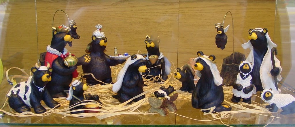
Wondering why there are bears at the top of this article?

Well, besides the fact that I like bears, allow me to explain both Tabor’s problem as well as Goodacre’s rebuttal with a metaphor about the Nativity. I’m not poking fun at Tabor or Goodacre (in fact if I’m poking fun at anyone, it is you, kind reader). I am simply trying to explain things in an easier way to understand them. With that in mind:

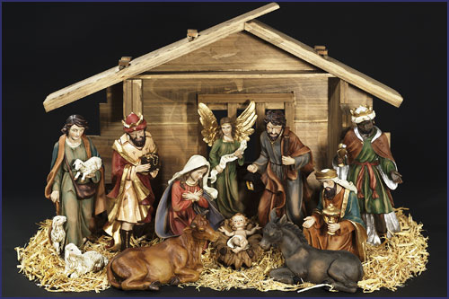
There we go. Here’s one that’s more bearable…
.. er I mean *less* bear–.. Nevermind.
You get the idea.

The Nativity is something that nearly everyone in the western world should be familiar with. It is a vignette of the birth of Christ in the manger with his earthly parents Mary and Joseph, heralded by Angels, given adoration by Shepherds and gifts from the Three Magi: Melchior, Caspar, and Balthazar.

If anyone were to come across these elements together, they would immediately say, “It’s a nativity scene” as that’s simply what’s in one, and this arrangement of elements is more or less unique. One can’t simply say “these elements are common” and that it’s by chance they all fall into the same place as the odds would very well be against them.

This is Tabor’s argument.

But then one asks: Does the Nativity scene actually represent what is in the Bible? All Nativities are actually a combination of the accounts about Jesus’ birth found only in Matthew and Luke. For example, Luke mentions Angels and Shepherds, Matthew does not. Matthew, on the other hand, mentions the Magi, and Luke does not. Some of the details from the scene don’t even occur in the Bible. To pick on the Magi again their traditional number and names are found nowhere in the Biblical account at all. There are also other traditional elements in the Nativity that do not seem to correlate with anything.

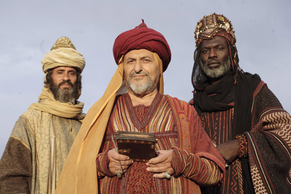
Melchior, Caspar, and Balthazar.
These Three Kings of Orient are Mariamēnē. 
In Tabor’s argument.
In the Nativity metaphor.
If this is confusing at this point it’s only because you’ve only been skimming the pictures.

Because this set of elements does not faithfully describe the Biblical account (as to come at this set of elements requires some selective picking and choosing from the Bible as well as picking and choosing from some late sources well outside of the Bible), the actual set, itself is meaningless for historical comparison.

This is Goodacre’s argument.
In summary: Where Tabor wishes to call what looks like it could be a Nativity a Nativity, Goodacre doubts that the Nativity represents the Biblical account in the first place.
I hope this clears things up. 🙂
Peace,
-Steve

A Post Mortem Of The Resurrection Tomb Live Blogging

Where I was rather ill (blasted cold…), Bob Cargill, Mark Goodacre and Tom Verenna were having lots of fun live-blogging through The Resurrection Tomb Mystery last night.

Here are some of the highlights!

Bob’s comments:

“CGI is well done. Simcha’s CGI folks get an A+ (especially since we see so much of it in the documentary. And the press. And the book. And the website.)”


NOW THEY’RE GLOWING! SHOW THE ACTUAL PHOTOGRAPH!!!!

We kept being told, “Just wait for the documentary. You’ll see the actual pictures.” But there were none. There were better pictures on the website. The documentary kept showing a rotated vessel and inked circles to make them look like ‘fish’. And you now see why they rotated the fish from the catacombs scene. It’s a visual trick to prime the brain to see similar fish.

In the words of Gerald Ford, let us hope “our long national nightmare is over.” 🙂

Mark’s comments:

They are pressing on after making progress.  But the cable has snapped and they’ve hit a problem, a problem of the kind that in documentaries requires an . . .

. . . . ad break!

10.55: My wife has fallen asleep.

11.00: the documentary is over.  No real surprises.  One big disappointment for me was not seeing more of the ossuaries and the tomb itself.  I was surprised to see just how often they mentioned Joseph of Arimathea and just how weak the attempts to link the tomb to Jesus appeared. 

“Debate is just beginning”  Well, it’s been going on for six weeks or so and I’m afraid we are not persuaded.  Sorry, Simcha.  Sorry, James.

Tom’s comments:

That isn’t a skull, it’s a pelvis.

This rosette ossuary is the same filmed in the 2007 doc.

OMG!  Did they just TILT the orientation to make it look like a fish?!  Wow, talk about forcing the data to fit a conclusion here.

They keep using the CGI’d image, not actual photos.

Whew…that was brutally painful to watch.

Peace,
-Steve

A Little Bit More Perspective – A Demonstration

The original image on the left, the image that was corrected from a skewed angle shot on the right.

 
 So image manipulation can be fun when you do not have a reference to compare something to. This is why in my last post, Dr. Tabor made a very good comment:

What I asked Bob I will ask you. If you took a clear straight on picture of your face, tiled it at 45degrees, took a shot of it, at that angle and from the side a bit, then used these techniques to “correct” perspective do you think you would end up with a photo that pretty much looked like you, proportional and pixel wise. In other words, does the stretching process shift things around. Maybe you can give it a try. It would be interesting.

I had actually been working on something just like that on and off for the past week or so to make sure that the technique I was employing worked properly without adding anything untoward to the final image.

Let’s take the following chalk doodle:

Head-on full perspective shot of our inscription.

I know I am not a master artist, but I tried from memory to reproduce a number of features on the “Jonah Ossuary’s” image roughly. It’s not completely well-formed and not completely symmetrical, but it isn’t too bad either (or so I like to think). 🙂

Also note the four dots. These are (quite literally) points of reference. If I were to skew this image in any direction, and still have these four points of reference and a rough idea of the ratio of the image’s width and height, it’s a simple matrix transformation to bring this image back to its original size.

This is why if we had a single shot of the Ossuary image that showed its top, side, and bottom borders, there would be no problem adjusting for perspective.

However, the images we have are missing some of these points of reference, simply because of how cramped the ossuaries in the tomb were packed. At best we can get one or two of them at a time.

In my reconstruction, I was able to estimate where the missing points of reference were by following the contours of known lines on the inscription and plotting where they intersected.

Note how the flat base look rounder now.

So, with using my masterpiece drawing, I took a shot on a high angle where I was missing points of reference.

From there I traced the contours of the image from what points of reference I had to estimate where the other points of reference might lie, “gridding” things out. As you can see, most of these lines are (excusing the pun) straightforward. 🙂

From there I applied the matrix transform, plus a few degrees of skew to compensate for camera lens distortion (as I did with my prior reconstruction) and this is what I got.

Comparing it to the original image, we can see that my method is not perfect, but it’s an extremely good approximation with negligible distortions.

In doing this I have realized ways that I can refine my original reconstruction:

1) Lens distortion can sometimes leave straight lines curved. This is especially the case with a fish-eye or wide-angle lens; however these can be corrected by using a simple filter in GIMP that can re-map one view angle to another.

2) Tracing contours can be made easier by checking other photos for reference. The bottom-most feature is nearly up against the bottom border in one shot, where in the large sepia shot I used the border was not easily visible. Lining those two photos up will allow a better approximation of the bottom-right corner of the reference frame.

3) The final image width-to-height ratio is very important. I based mine off of the relative proportions on the reproduction ossuary, but again checking the other photos more closely will allow a better approximation (which won’t be much different, but every grain of accuracy counts). 🙂

All in all, I think it works well.

Peace,
-Steve

A Little Bit More Perspective – The Patio Tomb Jonah Ossuary

Robert Cargill has made a video that demonstrates, step by step, how to correct the perspective distortion of the high-angle camera shots of the so called “Fish” on the “Jonah Ossuary”:

It’s nearly a half hour long, but it’s rather thorough.

I’ve been working on a similar perspective correction illustration by aligning the features of the drawing relative to its “canvas” (i.e. the size and shape of the ossuary itself).

I first started out with image #14 from the “The Jesus Discovery” website as it is so far the most complete of the pictures released.

It may be labeled “no CGI” but that’s a little bit of a fib. As we’ve seen from other images of the ossuary, this nice, uniform sepia tone is not the actual color of the artifact. This image has been put through a filter or two. But never mind about that. 🙂

I essentially mapped out all of the perspective-relevant features: Lines that should be vertical and horizontal relative to each other, and then I mapped the “grid” that was created as flat as I could.

It’s not perfect, as there is a little bit of distortion from the lens they used (in my next iteration I’ll see if I can fix that) and I need to expand the right hand side a bit more; however, we can see that when the features are more or less aligned relative to each other, and the final frame is re-sized to something the proportions of its place on the ossuary, we get something very vessel-like, and not ichthymorphic at all.

The rim is as wide as the hip of the vessel and “Jonah’s head” is flattened to a half-spherical base.

Since Bob was able to do this with one image, and I was able to do this with another, my haphazard guess is that if every photo of the “fish” we have was adjusted for perspective, it’ll end up looking similar to this as well. 🙂

Peace,
-Steve

UPDATE March 23: Some additional illustrations for my discussion with Dr. Tabor in the comments.

This illustrates how image #14 (on the bottom) is filtered compared to the “raw” image #15 (on top) where both are labeled “no cgi.”
This illustrates how the reproduction ossuary did not capture the proper shape of the head/base.

Did Simcha Arrive Early to the Party?

He’s even wearing the same shirt.

So, among the images that have been posted on the Jesus Discovery website, I found three shots of Simcha Jacobovici that were taken back in 2005.

Because of this, I find myself scratching my beard in curiosity as to why they’re mixed in with other photos from a project that took place between 2009 and 2011 (which is where all of the other photos fall).

Granted, they’re nice shots — somewhat dramatic — but they are rather out of place.

Is this so-called “documentary magic”? 🙂

Peace,
-Steve