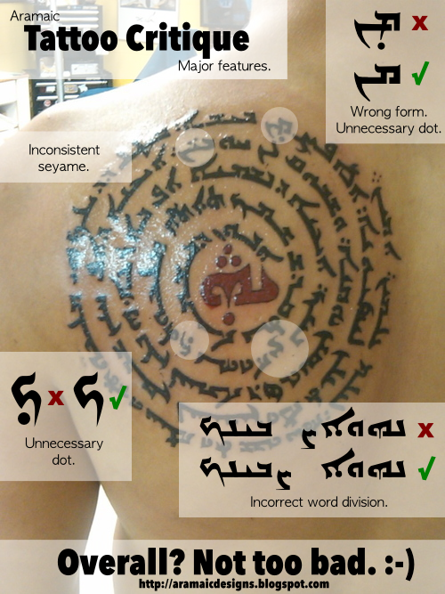
A potential customer brought this tattoo to my attention. Overall it’s not too bad. It’s completely legible and all in the right order (bravo!). There are — however — a few things that need to be addressed:
- Half of the small number of things that rub me the wrong way is the inconsistent use of diacritical marks. There is only one seyame (plural marker; the two little dots above a short letter) in the entire design, and when you use seyame in one place, it’s customary to use it throughout the document.
- Another stray diacritical mark is a dot under the ܟ (kaf) in ܡܠܟܘܬܟ (malkuthakh = “your kingdom”). Here, this mark’s purpose is to indicate that the ܟ (kaf) is pronounced soft (like ch in Bach). Again, if you use it in one place, you’re expected to use it throughout the document unless it is specifically to disambiguate places where it’s not obvious. (Which this is not.)
- Next, we have another stray dot under ܡܢ (men = “from”) as well as a final ܡ (mim) at the beginning of a word. A dot could occur here in un-marked texts to disambiguate ܡܢ (men) from ܡܢ (man = “who”), but again, it’s inconsistent and unnecessary in this context.
- Finally, there is a case of incorrect word division, which given its position (a descender right above an ascender, which could potentially overlap) is excusable, but there are other ways to resolve overlapping writing than this.
However, these errors aside, this is one of the better Syriac Lord’s Prayer spirals that I have seen that I did not aid in typesetting (and I know that sounds like I’m tooting my own horn… but seriously it personally pains me when I see avoidable mistakes). 🙂
Peace,
-Steve

